Selecting the Perfect Font for Your Product
In the realm of consumer engagement, product label design stands as one of the initial and impactful channels through which brands can establish communication with their desired audience. Regardless of whether your niche involves crafting luxurious bath essentials or delectable snacks, the reality is that a significant portion of your potential customers may not have the opportunity to physically experience or savor your product prior to making a purchase. In the absence of tangible proof regarding the quality of your offering, the pivotal question emerges: how can you persuade them to invest their valuable resources in your product amidst the myriad alternatives adorning the shelves? The answer lies succinctly in three powerful words: product label design.
The Significance of Font Selection in Enhancing Product Labels .
Choosing the right font may seem like a minor detail, but its impact is significant. Consumers often unconsciously establish associations with fonts, attributing characteristics such as personality, values, and style. Whether they are aware of it or not, individuals make swift connections and assumptions based solely on the choice of font. Furthermore, opting for a font that strikes a balance between readability and visual appeal can enhance the overall experience for your customers. In essence, the seemingly trivial decision of selecting a font carries the potential to shape perceptions and contribute to a positive customer interaction.
Typeface vs. Font
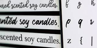
Although the terms “typeface” and “font” are occasionally employed interchangeably, they bear distinct meanings. The term “typeface” pertains to the visual design or style of the text, encompassing aspects such as size, weight, and style variations. On the other hand, “font” denotes the specific implementation or utilization of a typeface, encompassing a particular size, weight, and style within that typeface family. Typography experts have aptly drawn a parallel between typeface and font, likening it to the relationship between a song and an MP3 file, emphasizing the tangible versus the utilized. In essence, a typeface serves as a broader category, akin to a musical composition, while a font is a specific iteration within that category, much like an individual MP3 track. To illustrate, Helvetica constitutes a typeface, whereas Helvetica Bold qualifies as a distinct font within the Helvetica typeface family.
Define Your Target Customer
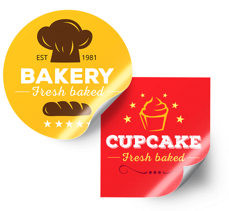
Selecting the optimal font for your product label design begins with a meticulous understanding of your target customer. It is crucial to distinctly identify the preferences and personality traits of your intended audience to ensure that your font resonates with them as they peruse the shelves. Take, for instance, a scenario where you produce delicate fine wines and aim to attract a sophisticated customer base appreciative of refined products. In such a case, opting for a whimsical and playful font would be incongruent with your brand image. Instead, a font that exudes classic elegance and beauty would be the more fitting choice, aligning seamlessly with the tastes of your discerning clientele.
Strategies to Make It Legible
When delving into the realm of typography, there’s a paramount aspect that transcends mere aesthetics: legibility reigns supreme! In the intricate dance of design elements, a font’s beauty should always bow to its readability. Imagine the potential loss of customers if your label’s message becomes an enigma due to an excessively ornate font choice—a pitfall that’s entirely avoidable. Visual allure undoubtedly holds sway, and a significant fraction of that allure hinges on the font’s ease of comprehension.
Opt for a font endowed with a fitting weight and style, ensuring legibility even from a considerable distance. The goal is to have your prospective customers effortlessly absorb the information on your label without giving a second thought to the font itself. Ideally, the font becomes an inconspicuous vessel, seamlessly facilitating the transmission of your brand’s distinct traits. Your product label design should be a conduit for easy reading, allowing customers to absorb and internalize your brand narrative effortlessly.


abSalam
Lorem ipsum dolor sit amet consectetur adipiscing elit, vestibulum lectus egestas cubilia nam sagittis, nulla posuere habitant